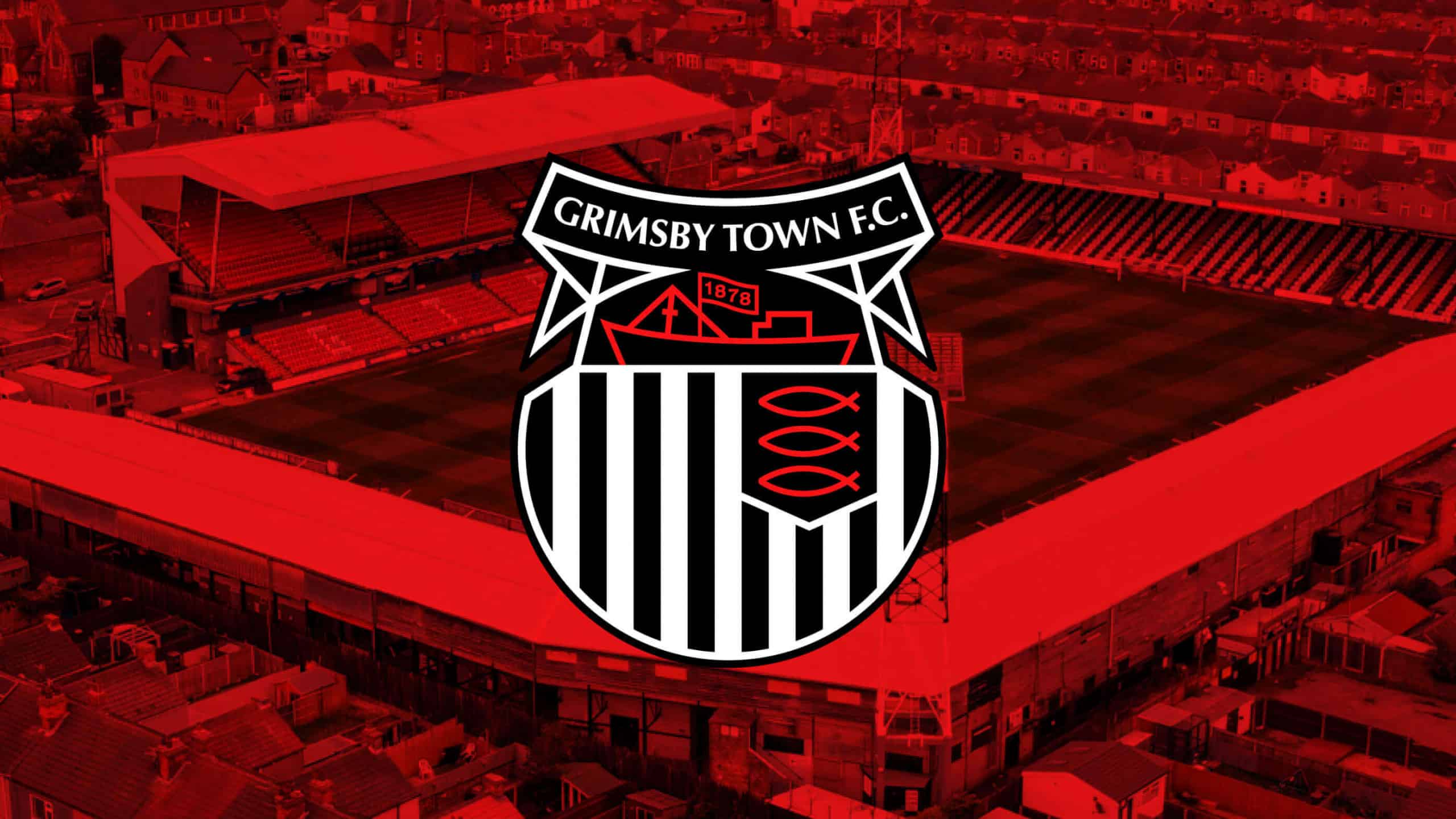
Grimsby Town Football Club is delighted to launch its refined club crest, 50 years after the introduction of the current style after teaming up with Mariners supporter Rich Lyons, designer at global giants Apple who took it upon himself to begin making technological tweaks to the crest prior to the Club’s takeover earlier this year by 1878 Partners Ltd.
We are also pleased to bring our supporters a new, custom website that has been designed and built from the ground up by local design consultants, Source Four with a focus on a more integrated user experience across all platforms. In addition, we have also launched the Club’s first-ever official brand guidelines, which will help align the Club’s image and ensure continuity and consistency, creating an instantly recognisable brand we can all be proud to be associated with.
Over the coming weeks, we will be inviting our supporters to complete a feedback form to give their opinions on our new website and where they feel that improvements can be made to help enhance the user experience.
Mariners Chairman, Jason Stockwood spoke of the decision to introduce a revised crest and the creation of the Club’s first-ever brand guidelines.
“On behalf of the Board, I’d like to say how grateful we are to Rich for the excellent work he’s done to refine and subtly upgrade the Club crest. The expertise and talent he has brought to the project is an amazing gift to the Mariners, marking this New Year, new era and a brand new chapter for the Club.
“This work sits neatly with our new responsive website and the first-ever Club brand guidelines. All part of the continuous improvement we are committed to.”
Why A Refined Crest?
A Story from Rich Lyons

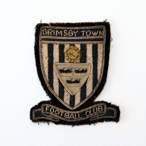
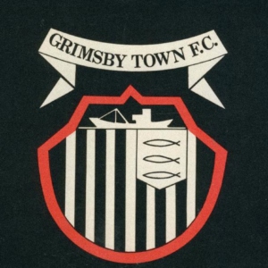
The Grimsby Town club crest in its current form is celebrating its 50th year and was devised in 1972 by George Palejowski of The Carpathian Lancers that settled in Grimsby after the war, who then went on to become an architect. Although many of the immediately-recognised features were there, it has changed peripherally over the decades, due to slight tweaks or print reproduction. Every iteration of it has a small story to tell. When did the fish get eyes? Who refused to place a full stop after the ‘C’? Walk around Blundell Park and you’ll see at least four or five different versions of our favourite shield and sash.

What is undeniable, though, is that our crest is one of the most loved and recognised in the English footballing pyramid. And so, any attempt to over-simplify or reinvent it would understandably be met with scrutiny. The reality is, things have changed a lot since 1972, and our current crest needed some love to work better in a digital age.
That’s why I challenged myself to improve on the current version, without destroying its legacy – making it fit for a club with incredible history and ambition for the future.
I’m a graphic designer and lifelong Mariner, and a dream project of mine has always been to work on a club crest or kit design. I currently work for Apple on the team that designed both the iPhone and the software that runs on it, amongst countless other world-renowned products. Before that, I worked on the rebrands of Airbnb and Deliveroo with my previous agency, DesignStudio, which also completed the rebrand of the Premier League a few years back. It’s fair to say that when my passions for design and football ever combine, it gets my full attention.
At the start of 2019, I started to tinker with the current Grimsby Town crest, more out of curiosity than anything else. I was eager to figure out a better way to draw it geometrically, to improve on the many inconsistencies that had occurred due to hand-crafted modifications and analogue reproduction. My full-time job at Apple prevented me from dedicating enough time to working on it properly, so over the course of two years, I intermittently went back to it whenever I could.
When rumours of a takeover came around at the beginning of 2021, I decided to reach out to the club with a proposal to update the crest. Much to my delight, it was well received and the philosophy behind it married well with the plans 1878 Partners had for the club moving forward. My dream was becoming a reality.
There have been many recent trends of football clubs updating their crests – complete overhauls, like Leeds United attempted a few years back, or introducing unnecessary 3D shadows being two typical treatments. I didn’t want to alter our crest so much that it became unrecognisable, or add effects to it that would age badly.
The new crest is rebuilt entirely from the ground up, using the basic ingredients of the existing version – the sash, the shield, the stripes, the trawler, the fish and the club name. It is constructed wholly upon a grid of geometric shapes that are compositionally harmonious in their relation to each other, and the scale of components such as line weight and negative space have been optimised to allow the crest to be used at any scale – digitally and physically.
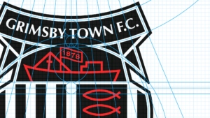
An added bonus of having this new version is that the key components can be easily extracted and used in other applications such as merchandise and social media content. Adding the 1878 flag to the trawler was a serendipitous moment – nonetheless, a loving tribute to the long legacy of the club, and a graphic device that sits nicely with the other elements.
Part of my day job is to design visuals and experiences with utmost attention to detail. I have dedicated as much time as is humanly possible to perfecting the new crest outside of my full-time work, and I couldn’t be happier with the product of that time and attention.
Around Christmas 2020, I was paying a visit to my dad’s grave in Holton-le-Clay cemetery. As I walked around the grounds, I noticed a fair few headstones featured the Grimsby Town club crest – a clear indication that there was a die-hard fan buried there. It was a stark reminder that our crest is such an important symbol of our passion for the club, and I hope my improved version is loved by our fans for decades to come.
Our New Website
As part of our rebranding, we appointed local design consultants, SourceFour to help build a new website from the ground up. Here are five of the major changes that you will find when navigating our new site.
1 – Updated Branding
A new year and a new era deserve a brand new identity and that is what we are bringing you. We have produced the club’s first-ever Brand Guidelines to ensure continuity is observed across all platforms and use of our club crest and assets. These will be recognisable over the coming months as we ‘drip feed’ our rebranding efforts. Examples of the former crest and brand will be visible across the club for some time, as we won’t spend money making cosmetic changes for change sake.
2 – Full Control
For a number of years, our website has been hosted and designed by EFL Digital. This meant that we had been limited with a set structure and design provided to us. Our new website will allow us to continually amend and design our site to suit and ensure our newly created brand guidelines are adhered to at all times. The flexibility will also give us scope for continuous growth, additions and future-proofing.
3 – Club Managed Mailing List

As we now have full control over our website, this allows us to create our own bespoke mailing list, rather than one that is handled by the EFL. This will allow us to distribute important news and information to our supporters who sign up in a much quicker and efficient manner. Our targeted marketing across all formats will allow our supporters to keep up to date with the information they require in the fields they choose. We encourage as many of you as possible to sign up at the bottom of our home page at your earliest opportunity and never miss an update!
4 – Fully Responsive
Over 75% of users view online content on their mobile devices first. Our site is built from the ground up with an emphasis on targeting mobile-friendly devices first, ensuring streamlined capabilities across all platforms to provide a user-friendly experience for our supporters and visitors.
5 – Digitally Enhanced Experience

We can now host all our relevant digital content in one place. You will notice on our home page, supporters can view our latest uploads from YouTube, as well as a stream of our most recent Instagram posts. As our two most rapid growth platforms, we recognise these materials are important to our supporters.
Managing Director of Source Four Design, Robert Pritchard spoke of his delight to work with the club and discussed some of the changes that have been made and how they will help our supporters navigate our new site.
“I am born and bred in Grimsby and as a local businessman and lifelong Grimsby Town fan, I have fulfilled a dream to work with the Mariners. We have worked alongside a number of local businesses, such as Docks Beers, E-factor, Grimsby Institute, FlatFish, Ish Fish and many more.
“So what’s new? The navigation has been simplified, making it quicker and easier than ever before to reach the content you’re looking for. A new and improved League table and fixtures API, including a score widget, will make it easier than ever to stay in touch.
“We have also revamped the post pages, so pages such as club news, ticket news and fixture news have been revamped entirely to provide a greater user experience for your convenience. All the club’s latest news and ticket information is easily digestible from the new home page. From the home page, you can now also watch videos including pre-match and post-match directly from the home page for your convenience.”
Over the coming weeks, we would be grateful if our supporters could provide their feedback via the contact page located in the footer of our website. Let us know about any improvements or features you would like to see and we will be looking to rectify any issues noticed at our earliest opportunity and thank you all for taking the time to assist.
Finally, we are in the final stages of building and testing a new Club Shop website on a new platform to help enhance your online experience.
The results of our Fan Survey launched earlier this year outlined that a new online Club Shop should be a priority for the Club. We have listened to you and further prioritised our research into improving the e-commerce systems at Grimsby Town Football Club. We are hoping to bring this to you within the coming weeks, so be sure to sign up to our new mailing list to be there at launch!
